# Options Panel
On the top right-hand side of the Bootstrap Studio window is the Options panel. It is populated with a multitude of settings that let you modify everything about the look and feel of your designs.
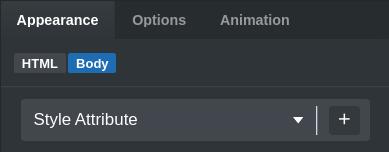
It consists of three main tabs:
- Appearance – Holds smart, user-friendly inputs for changing the CSS properties of the selected components.
- Options – It gives you a quick access to to all settings that are made available by the bootstrap framework.
- Animations – Let's you define smooth CSS animations that are triggered on Scroll, Hover or Page Load
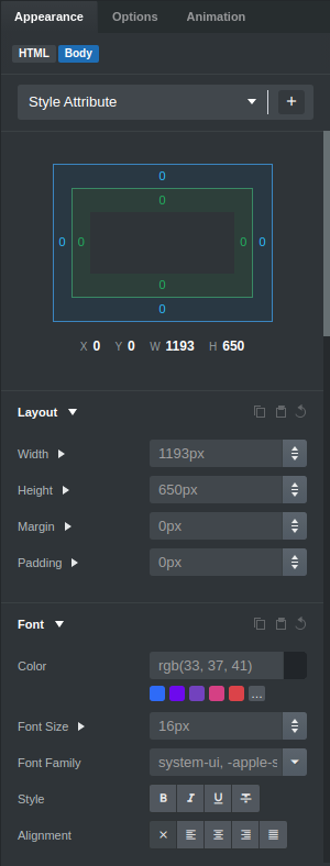
# Appearance
In this tab you can find controls for adjusting the CSS of components. All changes are reflected in real time in the stage, meaning you can see how changing a property is reflected in your design.
There are inputs for most of the commonly used CSS properties - from simple things like padding and borders to more complex CSS like transforms and filters. All of the inputs are visual and easy to use.
TIP
You can click the Margin label to reveal margin-top, margin-bottom, margin-left and margin-right sub properties. The same goes for Padding and others.
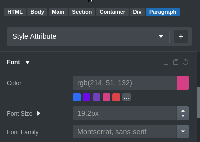
# Style Target Editor
Every customization in the Appearance panel is inserted as a CSS property. By default, these properties are applied to the element's style attribute, but you can change the CSS block that the generated CSS is to be inserted in from the Style Target Editor.
If you want to quickly add a new CSS block or edit the current one you can do it easily with these options:
 - Quickly edit the CSS block's selector or move the block to another CSS file.
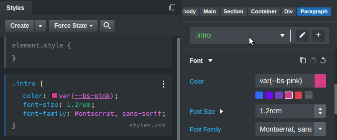
 - Create a new CSS block. It will be selected as the new target automatically and you can start adding styles to the new block right away.

TIP
If you enter a selector that includes an id or class names that the selected component doesn't have, the editor will add them automatically.
# Options
Depending on the selected component, Bootstrap Studio shows all settings that are made available by the bootstrap framework. This includes textual options, display and sizing, flexbox, borders and accessibility settings.
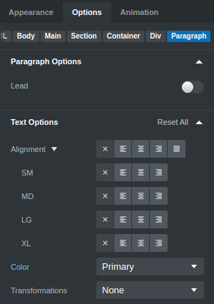
In contrast to the Appearance panel which works with CSS directly, the settings in the Options panel work with Bootstrap's classes. There is some duplication between the two, but it's recommended to use the options in this tab over those in Appearance whenever possible.
# Animations
The last panel is Animation, which lets you easily define smooth CSS animations that are triggered on Scroll, Hover or Page Load.
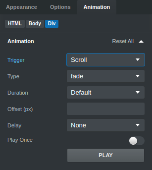
A lot of different effects and settings are available, which are explored in our animation tutorial.
# Multiselections
The visual editing workflow of Bootstrap Studio is made more powerful with multi-selections. Hold Ctrl/Shift (for Windows and Linux) or Cmd/Shift (on Mac) while clicking, to add components to a multiselection. This lets you change their appearance simultaneously.
This is a great productivity boost for those who prefer the visual nature of the app. For those of you who prefer writing code, you can achieve similar results by assigning class names to your HTML elements and writing CSS, as laid out in our CSS guide.
# Collapsing / Expanding
Like most panels in the Bootstrap Studio app, you can adjust its size and collapse/expand it. When the Options panel is collapsed, each of the tabs can be accessed quickly by clicking the respective icon.