# Sidebar Navigation
Sidebars are a popular alternative to the regular top navbar navigation. They have the benefit of freeing up valuable vertical space, but are more challenging to implement. In this article, we'll show you how.
# Building the Sidebar
The first step is to construct the sidebar out of the components in Bootstrap Studio's Components panel. We will base the sidebar around the Nav component. Here is the component tree:
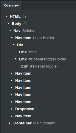
The first Nav Item will hold the logo with the hamburger icon, which will expand/contract the sidebar when clicked.
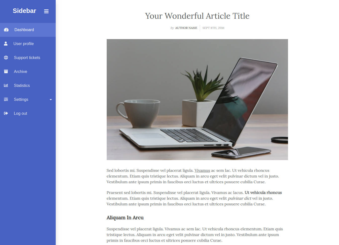
The Container will hold the regular content of your page. In our example, we added a mockup for an article page.
# The Code
The code below will apply the design of the sidebar, and define how it will look and function on different screen sizes. Note that the body needs to have relative positioning and a padding applied so that the sidebar has a proper size and offsets the content without hiding it.
sidebar.css
/* Body Styles */

body {
  position: relative;
}

@media (min-width: 992px) {
  body {
    padding-left: 14rem;
  }
}

/* Sidebar Styles */

.sidebar {
  max-width: 14rem !important;
  width: 100%;
  min-height: 100vh;
  background-color: #455dc7;
  position: absolute;
  top: 0;
  bottom: 0;
  left: 0;
  z-index: 1;
}

.sidebar .logo {
  font-size: 1.6rem;
}

.sidebar .nav-link:hover, .sidebar .nav-link.active {
  background-color: #5b72d6;
  opacity: 1;
}

.sidebar .nav-link span {
  font-size: 1rem;
}

.sidebar .dropdown-toggle:after {
  display: none;
}

.sidebar .dropdown-menu {
  position: relative !important;
  padding: 0;
  margin: 0;
  width: 100%;
  overflow: hidden;
  transform: unset !important;
  top: unset !important;
  left: unset !important;
  min-width: unset !important;
  background-color: #3a51b5;
  border-radius: 0 !important;
}

.sidebar .dropdown-item {
  padding: 0.8rem 0 0.8rem 1.5rem;
  margin: 0;
}

.sidebar .dropdown-item:hover, .sidebar .dropdown-item:active, .dropdown-item:focus {
  background-color: #6177d9;
}

.sidebar .nav-link {
  padding-top: 1rem !important;
  padding-bottom: 1rem !important;
  font-size: 1rem;
  position: relative;
  opacity: 0.9;
}

.sidebar .fas.fa-caret-down.float-none.float-lg-right.fa-sm {
  position: absolute;
  top: 50%;
  right: 5%;
  transform: translate(-50%, -50%);
}

.sidebar.collapsed .nav-item:not(.logo-holder) {
  display: none !important;
}

@media (max-width: 991px) {
  .sidebar.mobile-hid .nav-item {
    display: none !important;
  }
}

.sidebar.collapsed #sidebarToggleHolder {
  position: absolute !important;
  color: #858791 !important;
  left: 0;
  top: 0;
  padding: 10px;
  z-index: 999;
}

@media (max-width: 991px) {
  .sidebar.mobile-hid #sidebarToggleHolder {
    position: absolute !important;
    color: #858791 !important;
    left: 0;
    top: 0;
    margin: 10px;
    z-index: 999;
  }
}

.sidebar.collapsed .logo #title {
  display: none;
}

@media (max-width: 991px) {
  .sidebar.mobile-hid .logo #title {
    display: none;
  }
}

.sidebar.collapsed #sidebarToggleHolder {
  float: none !important;
}

@media (max-width: 991px) {
  .sidebar.mobile-hid #sidebarToggleHolder {
    float: none !important;
  }
}

.sidebar.collapsed {
  width: 0 !important;
}

@media (max-width: 991px) {
  .sidebar.mobile-hid {
    width: 0 !important;
  }
}

.sidebar #sidebarToggleHolder {
  font-size: 20px !important;
  margin: 7px 5px;
}
Our JavaScript has the responsibility of making the sidebar work by binding event listeners and switching between the sidebar's various states on window resize.
sidebar.js
(function($) {

    let win = $(window);
    let w = win.width();

    let body = $('body');
    let btn = $('#sidebarToggle');
    let sidebar = $('.sidebar');

    // Collapse on load

    if (win.width() < 992) {
        sidebar.addClass('collapsed');
    }

    sidebar.removeClass('mobile-hid');

    // Events

    btn.click(toggleSidebar);

    win.resize(function() {

        if (w==win.width()) {
            return;
        }

        w = win.width();

        if (w < 992 && !sidebar.hasClass('collapsed')) {
            toggleSidebar();
        } else if (w > 992 && sidebar.hasClass('collapsed')) {
            toggleSidebar();
        }
    });

    function toggleSidebar() {

        if (win.width() < 992 || !sidebar.hasClass('collapsed')) {
            body.animate({'padding-left':'0'},100);
        }
        else if (win.width() > 992 && sidebar.hasClass('collapsed')) {
            body.animate({'padding-left':'14rem'},100);
        }

        if (!sidebar.hasClass('collapsed')) {
            sidebar.fadeOut(100,function(){
                btn.hide();
                sidebar.addClass('collapsed');
                btn.fadeIn(100);
            });
        }
        else {
            sidebar.removeClass('collapsed');
            sidebar.fadeIn(100);
        }

    }
})(jQuery)
And with this our sidebar is ready! You can easily customize it in Bootstrap Studio by adding more entries in the Nav, changing the text, links and colors.