# Overview Panel
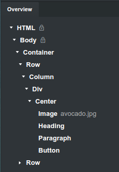
The Overview panel gives you an outline of all components your page is constructed from.

# Dragging Components
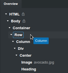
In the Overview panel you can select, drag and place components elsewhere on the page. The app will show you indication whether the component can be dropped in the hovered component or not. You can also drop components on the stage.

# Labels
To make your design easier to navigate, you can set labels on components. They will be displayed in the overview next to the component name.

You can also activate the Export Labels option in the export settings. When it's switched on, the application will wrap your component inside start/end comments.
<!-- Start: Avocado Card -->
<div>...</div>
<!-- End: Avocado Card -->
This can come handy if you wish to integrate the exported HTML with an external system.
# Expand / Collapse
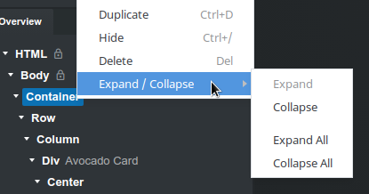
To make navigating large trees with components easier, you can right click an item in the Overview panel and select one of the options in the Expand menu. This lets you Expand or Collapse the component and all its children.

