# Designing Responsive Pages
Bootstrap Studio gives you a number of tools, components and techniques for creating responsive designs that look great on any device.
# The Bootstrap Grid
The main way to make adaptive page layouts with Bootstrap is the grid system (opens new window). Bootstrap Studio makes working with the grid super easy. The app takes care of all the HTML markup for you and offers user-friendly buttons for adjusting the layout to your needs.
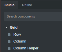
# Rows and Column
Inside the Grid group you can find the Row and Column components. Those are the primary building blocks of any grid layout.
Here are the basic concepts:
- The grid consists of a Row and one or more Column components inside it.
- You can place Rows anywhere on the page, including inside Columns, thus creating a nested grid.
- The Row takes the full width of its parent.
- Columns can take a certain part of the Row, from 1/12th all the way to 12/12ths (taking the entire width of the row).
- Columns sit next to each other on the same line inside the row, but if their widths exceed 12 parts, the first column that doesn't fit breaks onto a new line.
- Columns can have a different width for each of the bootstrap grid breakpoints. This makes it possible to adapt the layout depending on the available space on different devices like phones, laptops and desktop monitors.
As a simple rule, always start with a row and add columns inside it. Then, any actual content goes inside the columns.
# Column Toolbar
After the general outline of your layout is ready, you can start adjusting the size and responsiveness of the columns. When a column is selected, a toolbar will appear with options for changing the order and size of columns, as well as buttons for quickly adding more columns to that row.
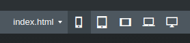
Any changes made with the toolbar will be applied for the currently active breakpoint. This means that resizing the stage horizontally changes which breakpoint you are modifying.
In the video above, we are modifying the "SM" breakpoint, and in this image, the active breakpoint is the smallest one:
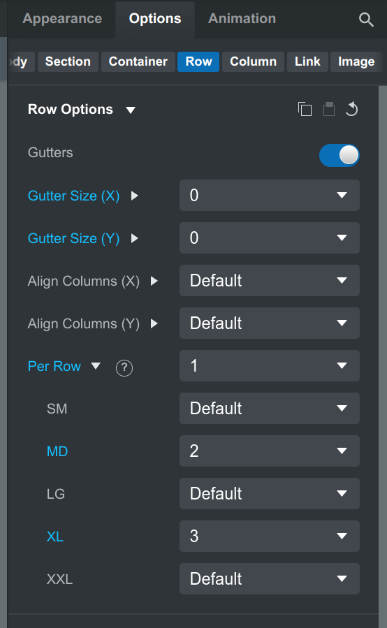
# Row Options
For finer tuning, you can modify the column sizes from the Options Panel. Here you have more settings for the way columns are displayed and the ability to adjust each option for a specific breakpoint.
Select the Row component, and you can see options for modifying the gaps (spacing between columns), and how many columns to show on each breakpoint.
# Column Options
If you need control over the size of a specific column, you can select the Column component and inspect its options.
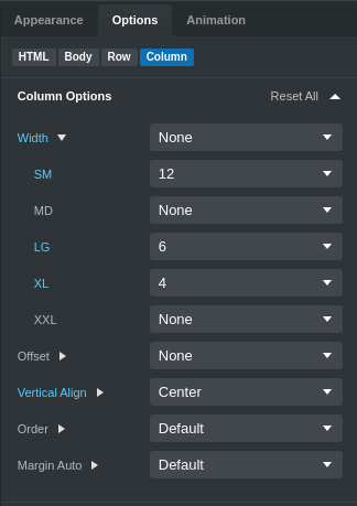
This lets you apply sizes for this particular column, offset it, align it vertically and more.
Note that the widths in Column options are represented on a 12 point scale. You can learn more in Bootstrap's grid system docs (opens new window).
# Conditional Visibility
The Display and Sizing options offer a quick way to hide, show, or change the display type of any element depending on screen size. You can find them in the Display and Sizing group in the Options Panel.
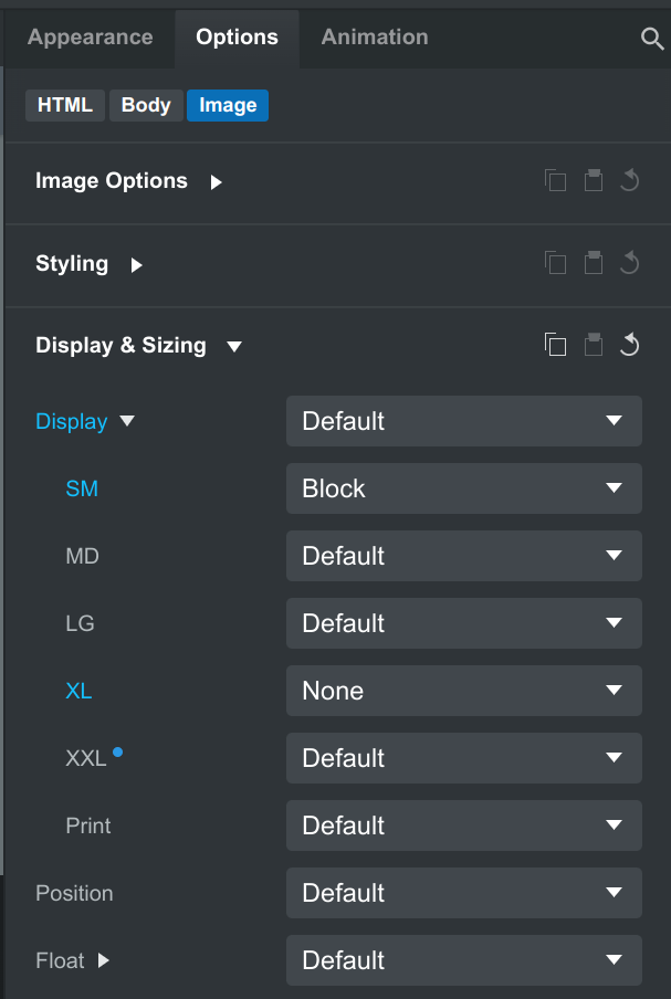
A common way to use conditional visibility is to show an element on mobile but hide it on desktop.
# Breaking Columns to New Rows (Clearfix)
For some layouts, you need to clear columns to a separate row. This is why Bootstrap Studio gives you the Column Helper component. You only need to drag and drop it between two columns and to give it the correct Responsive Display class to limit when it is active.
# Media Queries
If you are well versed with CSS, you can achieve anything by writing code in the CSS Editor. Every CSS block can have a media query applied.
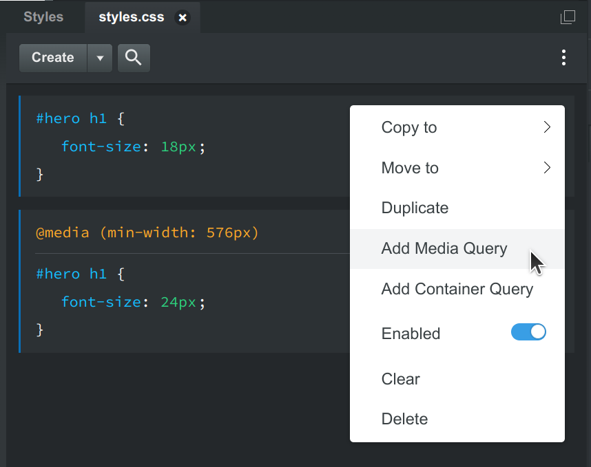
Bootstrap Studio can help you quickly define media queries via the CSS editor context menu. Clicking the Add Media Query option will add the needed markup and will target the currently selected breakpoint size.
The app helps you define @media blocks but you still have full freedom of how you setup your media queries and what styles are defined inside them.