# Custom Options
Bootstrap Studio lets you add custom checkbox and dropdown options to the Options panel of any component on your page for controlling class names and attributes. This is a good way to create reusable components that you can add to your library or share.
# Custom Options Editor
To add custom options to a component, right click it and choose Add Custom Options from the menu. This will open the Custom Options editor:
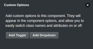
Here you can create two types of options:
- Toggle - presents a toggle-able switch in the component options. When enabled, a class name or attribute will be added to the element, otherwise it will be removed.
- Dropdown - presents a list of possible options as a dropdown. By selecting one of the options, the chosen class name or attribute will be added to the element.
Once you've added custom options, the component will be marked with an icon  , so you can easily spot it in the Overview panel.
# Toggles
To add a new toggle option, click Add Toggle in the Custom Options Editor.
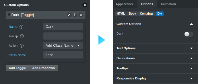
You can customize the following properties:
- Name - the label that will be shown in the Options panel for this option (defaults to the class/attribute name)
- Tooltip - a tooltip that will be shown after the label
- Action - choose whether the option should add a class name or an attribute to the element when it is active
- Class Name - the class name that will be added to the element
- Attribute Name - the name of the attribute that will be added to the element
- Attribute Value - the value of the attribute that will be added to the element
# Dropdowns
To add a new dropdown option click Add Dropdown in the Custom Options Editor.
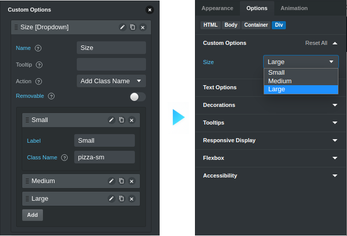
You can customize the following properties:
- Name - the label that will be shown in the Options panel for this option
- Tooltip - a tooltip that will be shown after the label
- Action - choose whether the option should add a class name or an attribute to the element when it is active
- Attribute Name - the name of the attribute that will be added to the element (if the Action is "Add Attribute")
- Removable - this will add an option "None" to the dropdown, which removes the class names/attribute set by this option
- Options - the options that will be shown in the dropdown
- Label - the name that users will see in the dropdown
- Class Name/Attribute Value - the class name/attribute value that will be added to the element
Note
If a dropdown option doesn't have a valid class name/attribute value, it will not be shown in the dropdown.
# Editing Custom Options
When a component has custom options you can easily edit its options through the Custom Options Editor. Just right click the component and click Edit Custom Options.
# Tips
- Copying and Pasting custom options - you can easily copy a component's custom options to another component by right-clicking it and selecting Copy & Paste > Copy Custom Options. This is a great way to transfer a configured set of options to other components quickly.
- Add to Library - you can add the component to your library as a user component and the options will be saved alongside it and be available when you drop it in a new design in the future. You can even share the component online.