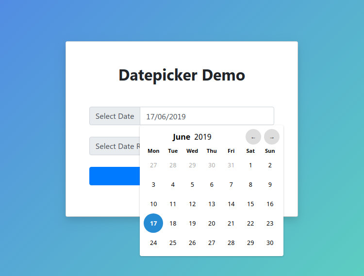
# Date Picker
Date Pickers are controls that let users select dates and time periods. Browsers have basic date selection built-in but for advanced use cases you often need a custom solution.
Luckily, this is easy to do in Bootstrap Studio. In this lesson, we will include the elegant Lightpicker library (opens new window), which supports both date and period selection.

# Importing the Library from a CDN
To start, we have to import our date picker library. The easiest way to do this is using a CDN and the Link External JS functionality in Bootstrap Studio's Design panel.
https://cdnjs.cloudflare.com/ajax/libs/litepicker/2.0.11/litepicker.js
The cool thing about this library is that it doesn't require any other dependencies. Even the date picker styles are bundled with the JS code.
# Creating the Inputs
In order to create our date pickers, we will first need to add inputs to the page. In the example design, we've simply added two text input components and styled them a bit using the standard Bootstrap options.

We've also set them unique ID attributes using the attributes panel so that it is easier to target them with JS.
# Initializing the Date Pickers
Now that we have our inputs, it's time to use the Litepicker library to turn them into date pickers. For this, we will need a bit of JavaScript.
Create a new JS file named datepicker.js and add the following code to it:
$(function(){

    let datePicker = document.getElementById('datePicker');
    let picker = new Litepicker({
        element: datePicker,
        format: 'DD MMMM YYYY'
    });

    let dateRangePicker = document.getElementById('dateRangePicker');
    let pickerRange = new Litepicker({
        element: dateRangePicker,
        format: 'DD MMMM YYYY',
        singleMode: false,
    });
});
This will display a regular date picker when the first field is selected, and a date range picker for the second.
You can change the way dates are displayed by adjusting the format option. The library API (opens new window) offers a lot of other options if you need further customization.
