# The Stage
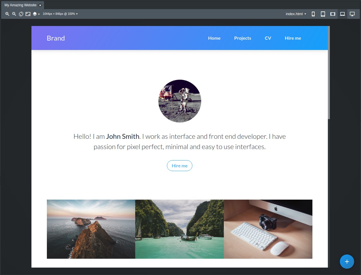
The stage is the middle section of the Bootstrap Studio window. It shows a live preview of the page you are designing, lets you move components and edit their text content.

# Resizing and Zooming
The stage can be resized to simulate any device size. Just grab one of the edges with your mouse and drag it:
You can also control the stage from these buttons:

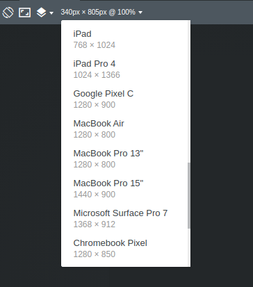
They let you zoom in/out, flip the width and height, and switch on the Fit to Canvas option, which resizes the stage to fill the central part of the window. Lastly, you have the current dimensions and zoom level. Clicking the latter will give you a list of device presets.
# Stage Menu
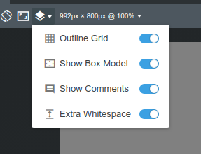
By using the dropdown menu on the top-left, you can control the overlays that the stage displays over the page.

- Outline Grid - will display the borders of rows and columns.
- Show Box Model - will display margins and paddings of components when you hover them.
- Show Comments - will show/hide comments that you or your team mates have left.
- Extra Whitespace - when on, will add extra padding to the bottom of the page so that it's easier to drag and drop components. This extra space is only added in the app itself and not when the design is exported.
# Breakpoint Buttons
These buttons can be used to resize your stage to match the width of the bootstrap grid breakpoints. This allows you to quickly test how your design looks on devices with various screen sizes, from mobile phones to desktop monitors.

# Custom Devices
Using the Device switcher, you can resize the stage to match the width and height of a specific device. There are a number of popular devices already defined but you can also add your own.

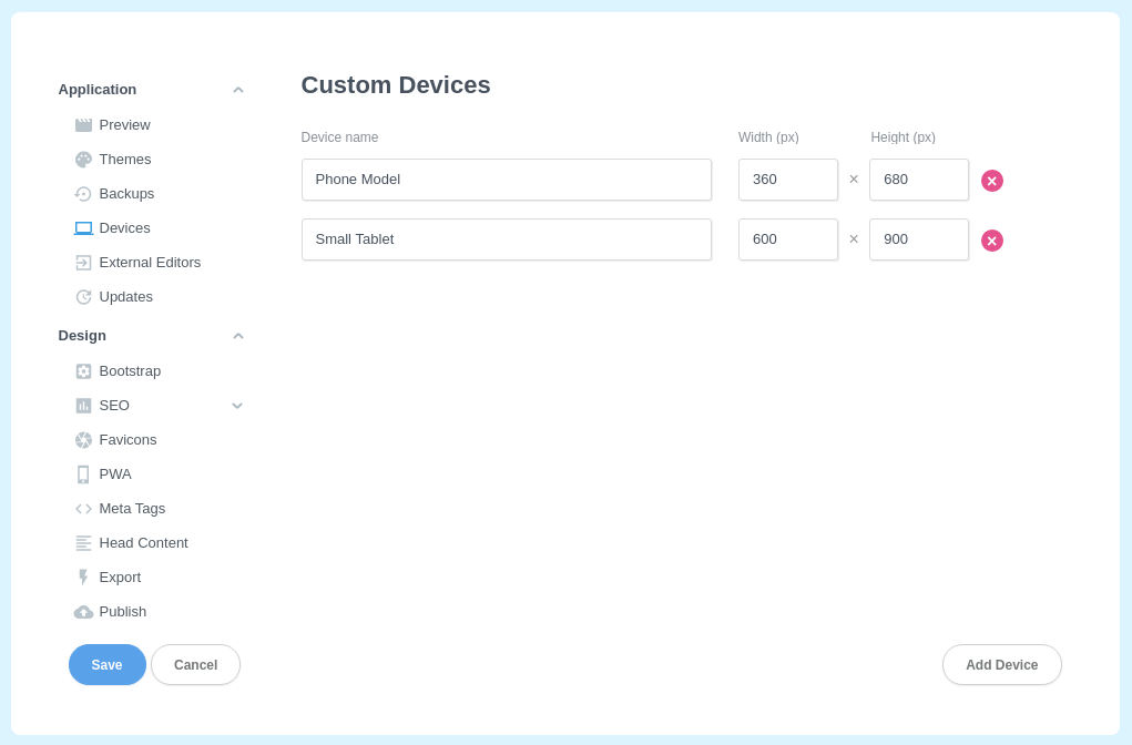
To add more devices to this dropdown, click the last option - Add New Device or just open the Settings dialog and switch over to the Devices pane.
Here you can set a name and width/height in pixels of your device. From that moment on, it will show up first in the Device switcher.

