# Icons
Bootstrap Studio comes with a rich library of free, ready to use icons. They are fully customizable, work in all web browsers and are nice and sharp on high dpi screens.
# Basics
Drag and drop an Icon component from the Component panel to the stage. Double click it to open the Icon browser.
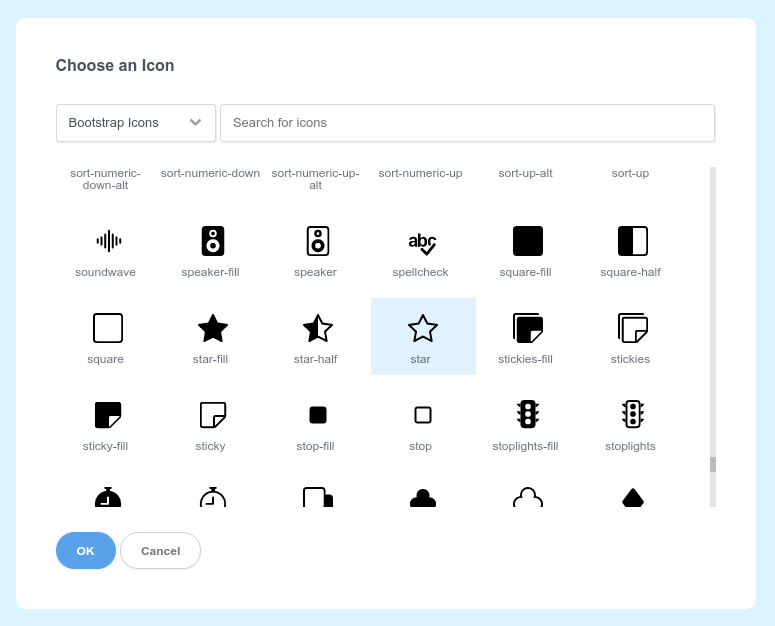
In this dialog, you can browse all available icon sets from the dropdown on the top left and search for icons by name.
Select one of the icons in the dialog and click the Save button (or just double click the icon). The Icon component will reflect the change.
# Customizing Icons
Depending on the selected icon set, the icons may be SVG based (Bootstrap Icons (opens new window), Tabler Icons (opens new window)) or web font based (Font Awesome (opens new window), Material Icons (opens new window)). There are slight differences between the two types (read the next section) but you can customize both via simple CSS.
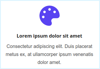
To change the size and color of an icon, use the font-size and color options in the Appearance panel. Here is an example of a styled icon:
The same applies when writing CSS in our CSS editor. Just override the font-size and color properties.
.my-icon {
	font-size: 20px;
	color: #1234af;
}
# SVG vs Icon Fonts
Bootstrap Studio comes with both icon font and SVG icon sets. Both SVG and icon fonts are rendered as vector graphics, making them sharp on all screen sizes.
SVG Icons
SVG icons are included as SVG markup inside the page itself. You can mix SVG icons from different icon sets freely. You can customize them with CSS properties like color, font-size, stroke, stroke-width, etc.
Icon Fonts
Icon fonts are sets of icons bundled into a single font file and behave like text characters. To avoid performance issues, stick to one icon font per project - mixing icon fonts adds extra font files to your page. You can customize icon fonts with standard CSS properties like color, font-size, text-shadow, etc.
The Icon component in Bootstrap Studio automatically detects the type of icon set and generates the appropriate HTML (either <svg> or <i> tags).
← Images Animations →