# Form Validation
Form validation is a way to guarantee that user submitted data meets specific criteria. It is similar to input masks, with the distinction that form validation is done when forms are submitted.
In the past, adding validation to forms required using plugins. But today modern browsers have native support for it, and it is straightforward to use in Bootstrap Studio. In this tutorial we will show you how to do it.

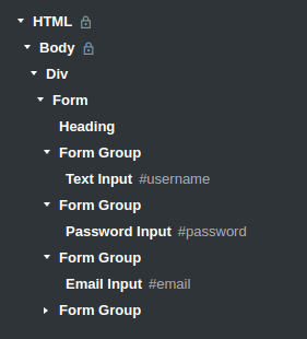
First, let's build the form. It needs to have 3 input fields and a submit button:
- Go to the Components panel and search for 'Form', then drag and drop it into the working area.
- Search for 'Form Group' in the Components panel and place it in your form. You need a 'Form Group' element for each component in your form.
- Go back to the Components panel and type 'Input'. You will find a wide variety of input fields that you can choose from. For our example we have used a text input, a password input and an email input. All of these are placed in a Form Group.
- Finally we need a button. Search for 'Button' in the Components panel and place it in your form. Go to the Options menu and select 'Submit' from the 'Button Type' option.
Note
The button needs to be set to the submit type, because validation takes place when forms are submitted. This is only possible when such a button is present.
Here is what our page structure looks like in the Overview panel:
And this is the HTML that Bootstrap Studio generates for you (only the contents of the form is shown for brevity):
<div class="form-group">
    <input id="username" class="form-control item" name="username" type="text" placeholder="Username" >
</div>
<div class="form-group">
    <input id="password" class="form-control item" name="password" type="password" placeholder="Password">
</div>
<div class="form-group">
    <input id="email" class="form-control item"  name="email" type="email" placeholder="Email">
</div>
<div class="form-group">
    <button class="btn btn-primary btn-block create-account" type="submit">Create Account</button>
</div>
# Validation Types
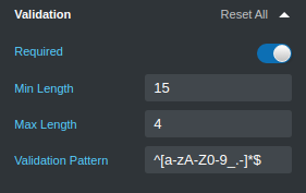
In order to add a validation rule to any of your input fields, select the component, go to the Options panel and expand the Validation group.
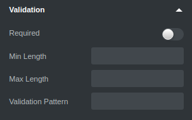
Here you will find 4 validation controls:
- Required - This option specifies that the input field can not be empty. It requires the user to enter something before submitting the form.
- Max Length - specifies the maximum number of symbols that the user can enter in the input field.
- Min Length - specifies the minimum number of symbols that the user must enter in the input field.
- Validation Pattern - specifies a regular expression that validates the entered data. We'll use this for the Username field in our form.
Let's take a look at some practical examples on how to use these options.
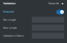
# Email Validation
For the email field all you need to do is to toggle the 'Required' switch. As this control is an Email Input, browsers will validate the contents of the field as an email address automatically.
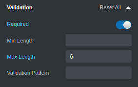
# Password Validation
For the password field we want the user to enter a password at least 6 symbols long. That's why we have placed a minimum length restriction.
# Username Validation
For the username field we have a more complex validation rule. We want the user to enter only numbers, latin letters (both lower and upper case), dots and underscores. That's why we use a regular expression ^[a-zA-Z0-9_.-]*$, alongside min and max lengths.
Now you know how easy it is to add validation rules for your input fields in Bootstrap Studio. You can test them with the browser preview or when exporting your design.