# Charts
Bootstrap Studio has a powerful Chart component that lets you create charts, graphs and other visualizations, customize them visually, enter data and modify them through JavaScript.
# Creating a Chart
To add a chart to your design grab the Chart component from the Components panel, and drop it onto your page. The component is fully responsive and will adapt to the available width. You can place it inside a Column to make use of the powerful Bootstrap Grid.
The Chart component is powered by the popular Chart.js (opens new window) library internally. Bootstrap Studio includes all necessary libraries and sets up the chart automatically for you.
# Chart Customization
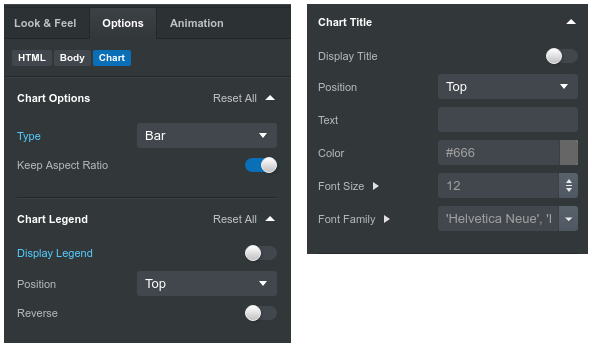
Select the chart, and switch to the Options tab in the sidebar. A large number of settings are available, starting with the chart type: Line, Bar (both horizontal and vertical), Radar, Pie, Doughnut, Bubble and Scatter. After this you have a number of customization options:
- Enabling/disabling the legend, and changing its position.
- Showing/hiding the chart title, changing its font family and size.
- Customizing the chart axes and their colors, thickness, beginning from zero.

Lastly you have a data entry section where you can change the chart labels and fill in data for your chart points.
# Modifying the Chart with JavaScript
In advanced use cases you might need to interact with the underlying Chart.js instance directly through JavaScript. Bootstrap Studio makes it easy by exposing the chart instance as a property of the canvas node. Here is how to access it from a JavaScript file in your design:
$(function(){

    let chart = document.querySelector('canvas').chart;

    $(document).on('click', function(){

        // When the document is clicked, update the chart
        // with a random value and animate it.

        chart.data.datasets[0].data[2] = Math.random()*10000;
        chart.update();
    });

});
You can read more about all available Chart.js methods in their API documentation (opens new window).
